Cylindo UI. Design System.
The project
When I joined Cylindo – now Chaos – in late 2021, the company grew rapidly, with the product development teams also quickly expanding.
Up to that point, not much work was put into standardizing components from a design perspective or building reusable components within the platform’s codebase.
This has been a huge project, and much work still needs to be done to mature the Cylindo UI Design System further. So buckle up and let’s talk about Design Systems 😊
My role
Cylindo UI is my pet project. It was created from my push to create standards that would reduce repetitive work, speed up and give freedom to the creative process, improve collaboration between designers and developers, and increase consistency across the platform. Still, it is ultimately an informal project – maintained and developed mostly by team members who are passionate about the intersection between design and software development.
With this in mind, I have 2 main roles in Cylindo UI:
- Facilitating collaboration to the project and getting people’s interest in collaborating. That includes structuring and leading the efforts related to the project (as its de facto Product Manager) and championing the Design System and its benefits to our teams and the end-users of our applications
- As the most experienced designer on the team and a frontend development enthusiast, I have been doing most of the actual design and, more and more, getting involved in the coding front.
Timeline
2022: Kick-off assessment, “design kit” cleanup and restructuring, creation of all basic styles and components in Figma, initial design/code alignment, color tokens.
2023: Creation of the cylindo-ui repository. Setting up an informal forum, project tracking in GitHub (now migrating to Jira), and bi-weekly sync for designers and developers. Further alignment between designs and codebase.
2024: Buy-in among the engineering team, multiple new components, and contributions from design and engineering team members.
2025 and future: Improved documentation, specialized components, patterns, templates, and versioning.
Background
Chaos Cylindo is a SaaS that enables retailers and manufacturers to produce 3D visualizations of their product libraries on a large scale. The company started with a single product offering, a configurable 360º viewer.
When I joined the company in November 2021, its CMS application consisted mainly of its super-specific project management tool. This tool connects companies that want their products produced in 3D with design studios that will model these products and the materials (textures) they will be rendered with.
At that point, the company was growing quickly and working on expanding its product offering to customers. We were then less than 20 people developing that product, including Product Managers, UX Designers, and Software Engineers, divided into 2 product teams and 1 backend/pipeline team.
In less than 1 year the product team had grown to close to 30 people, we were working on a couple of major products targeted directly at our users which would allow them to create imagery with their existing 3D models and easily distribute that content through their e-commerce platforms.
Given the growing number of products and tools within the platform, the fact that multiple teams would be developing those products separately, and the potential for increased inconsistency across the board, I identified the actual need for a Design System and proactively decided to focus on creating one to benefit the product in general and my colleagues more specifically.
That was the state of Cylindo’s “Design System” back in November 2021.
Kicking-off the project
The first step I took was to trace a strategy – the ultimate goal was to have a fully functional Design System, a single source of truth for all products and tools in the platform. To get to that point, I needed to:
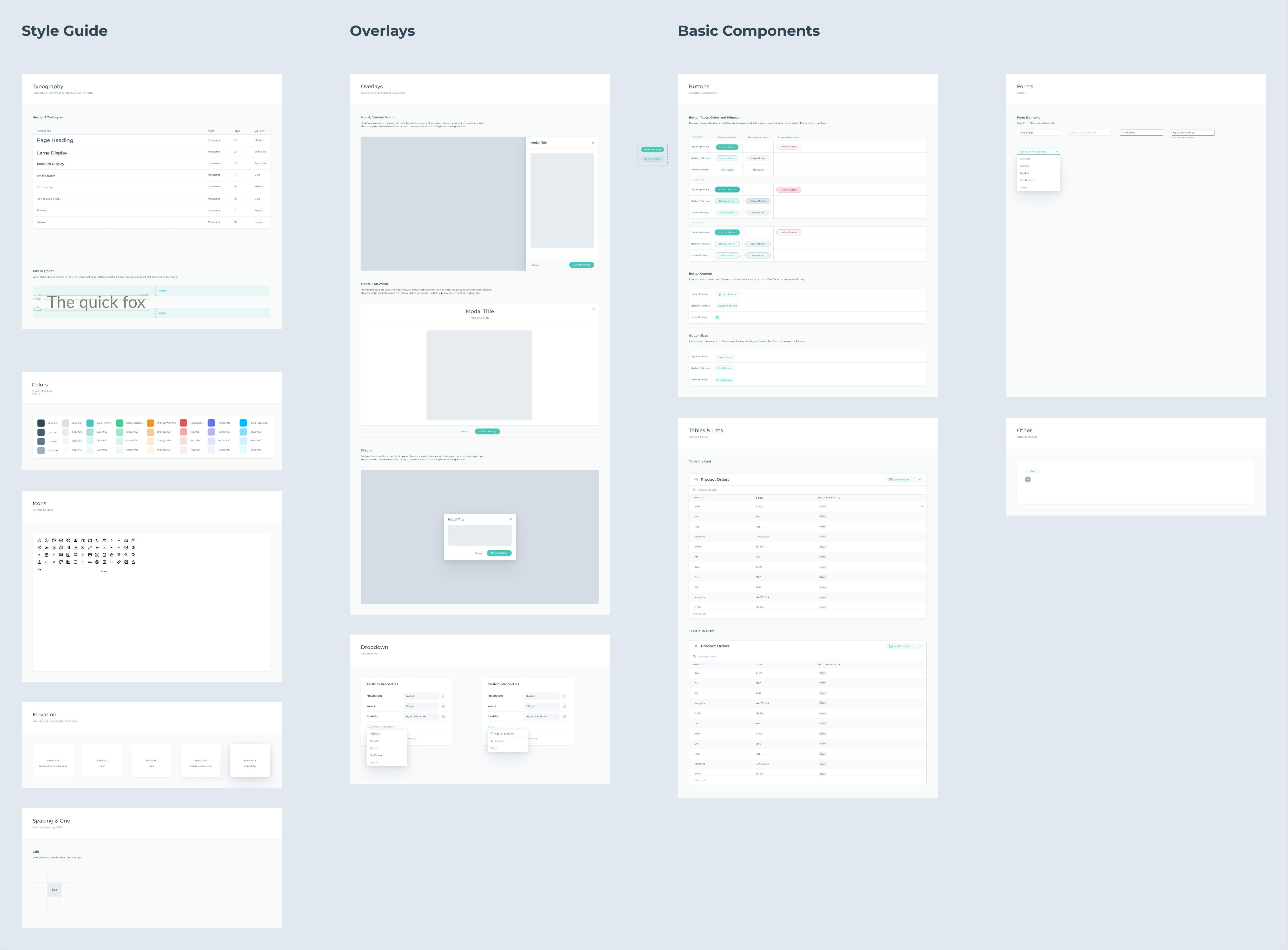
- Assess the state of the existing UI kit
- Define the foundations of a Design System (typographic styles, color palettes, spacings, elevations, iconography)
- Restructure the UI kit file and split it into the necessary Figma libraries
- In the Figma libraries, create styles for typography, colors, and elevations – categorize the icons in the library and convert those to components
- Convert the UI elements in a good state into Figma components
- Create Figma components for the missing UI elements most commonly used in the platform
Getting that initial load of reusable styles & components was an important first step and allowed the UX team to create designs more easily and with much-improved consistency.
The new components
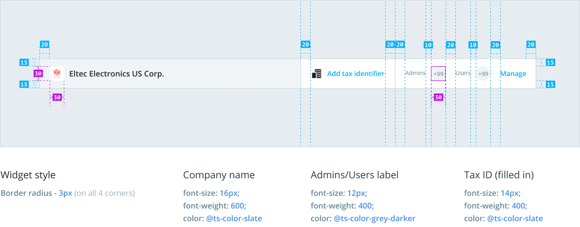
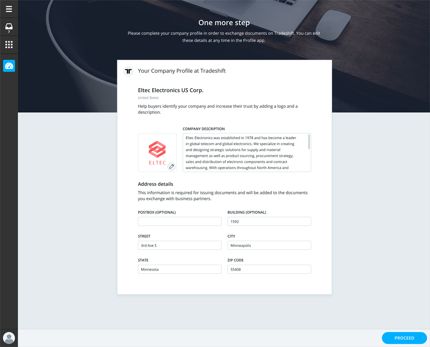
As a Project Management / CMS application, the first components to be rebuilt were the usual suspects: buttons, inputs, tabs, checkboxes, radio buttons, tags, dialogs, tooltips, etc.
This is a sneak peek at how the new components were set up, using the Input field component as an example.
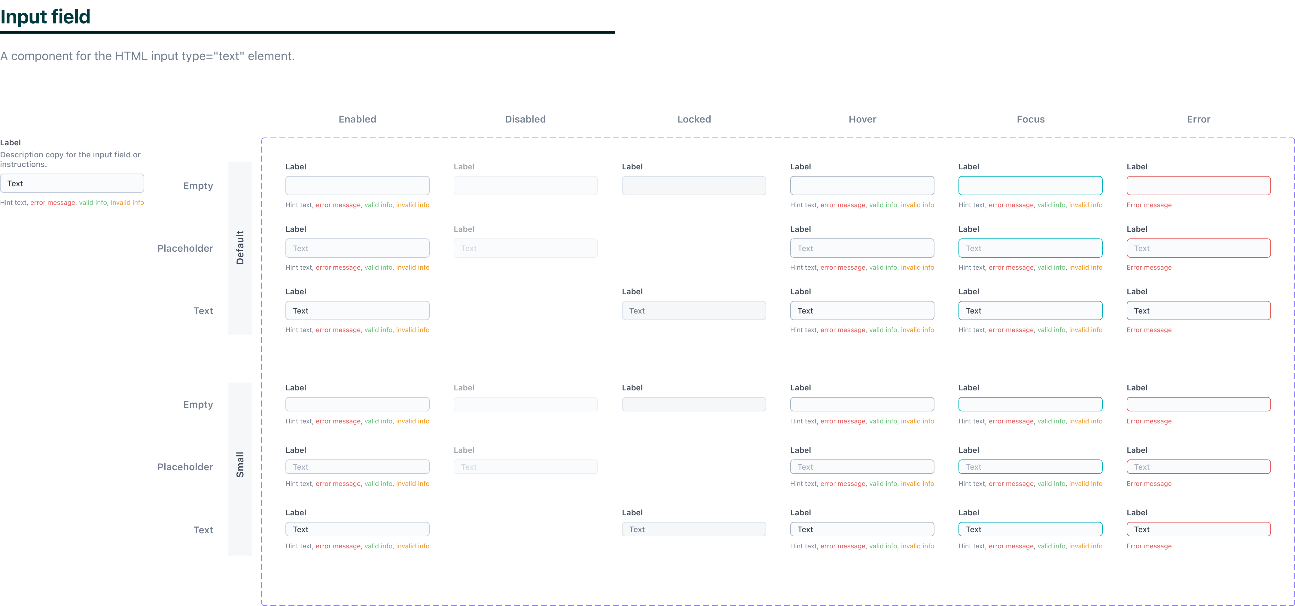
The newly built components included improved handling of states and interactions.
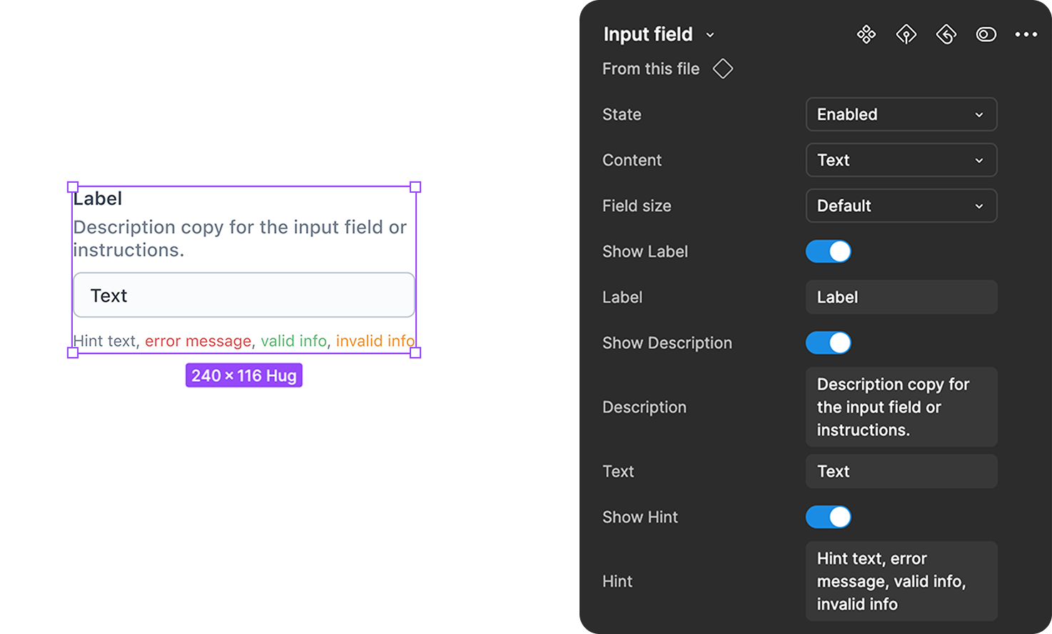
These components were also highly configurable, reducing the need for detaching.
Getting developers involved
Now one thing is building a beautiful library of components in Figma for designers to use, and a very different challenge is recruiting developers to join the effort of building a true Design System, especially when most of them are much more comfortable with backend work and used to doing things “the old way”. The result was slow progress for months.
I was lucky enough that in mid 2022 my Design System champion, Mikkel, joined our engineering team. He brought the energy and technical knowledge necessary to evolve the system and naturally took the lead from a development perspective.
Mikkel worked very hard on developing those basic components in line with the designs, and on super tedious tasks of applying these new components across the platform. Those new components were being documented in Storybook and more developers started using them.
All that work put us in a position where we could introduce broader changes with much more ease. And so we did later that year when the team organized a hackathon…

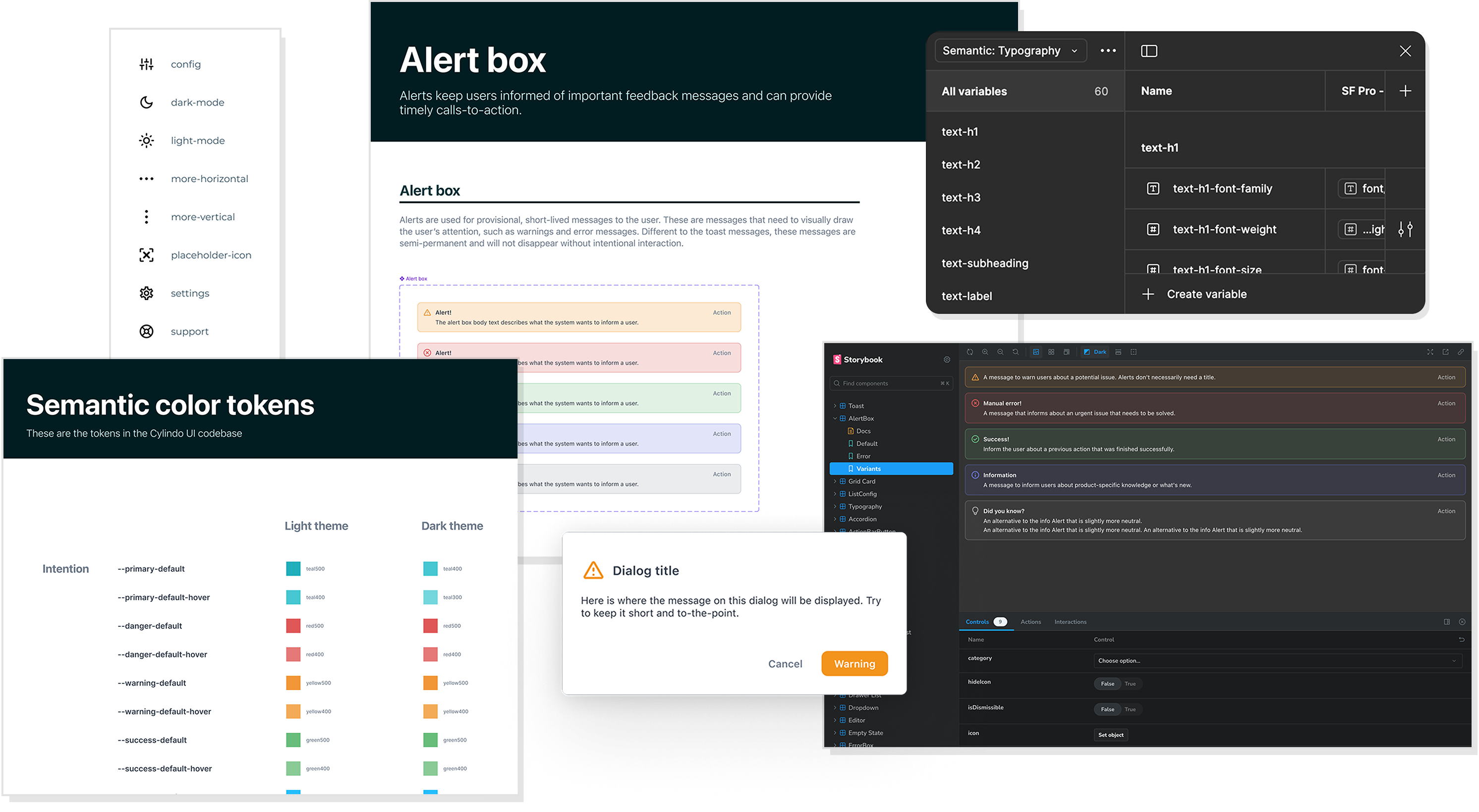
Color tokens and a dark theme
With most UI elements converted into standard components, we worked on a dark theme for the CMS application. To make that work, Mikkel and I introduced color tokens, applied both light-theme and dark-theme values to each token, and replaced all direct color references with the tokens.
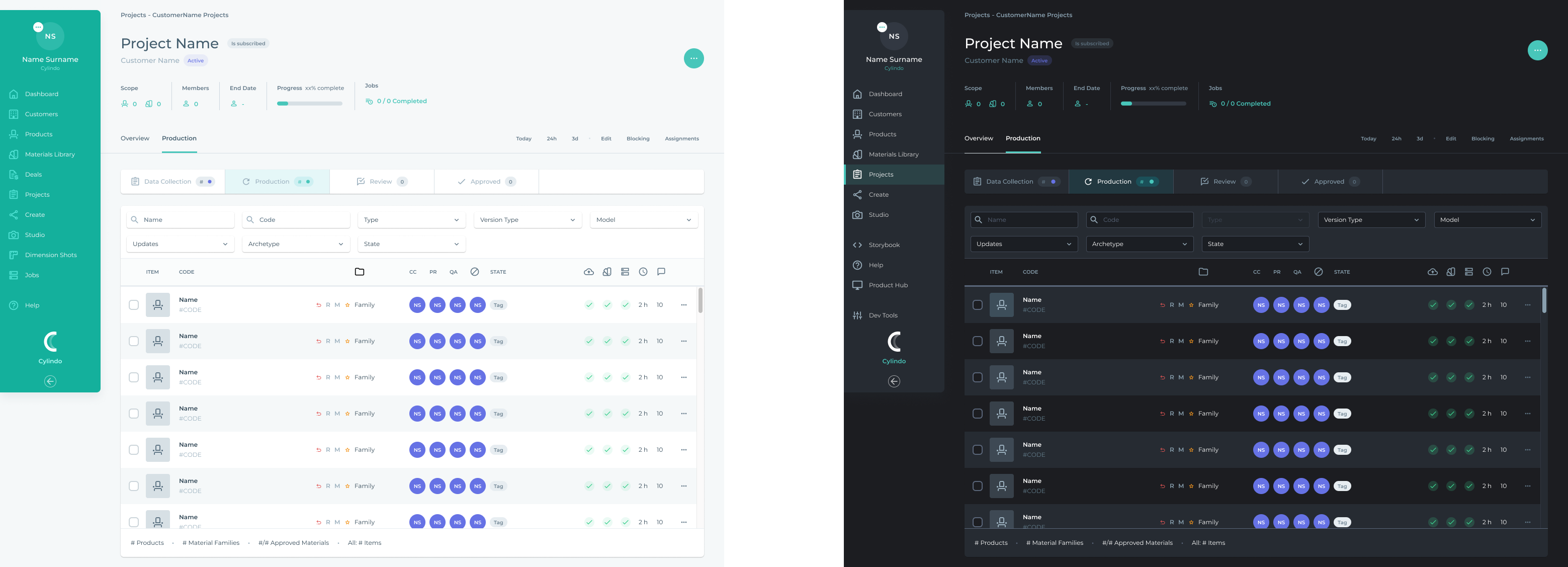
First, I picked one of the most complex pages in the application and defined what it should look like in dark-theme.
Cylindo UI has 2 levels of color tokens: Primitive color tokens and Semantic color tokens.
Primitive color tokens simply assign names to individual colors on our color palette. E.g.: teal-100, red-400, slate-grey-200
Semantic color tokens, as the name says, are variables with added meaning and intention. Those are key to scaling the design system consistently.
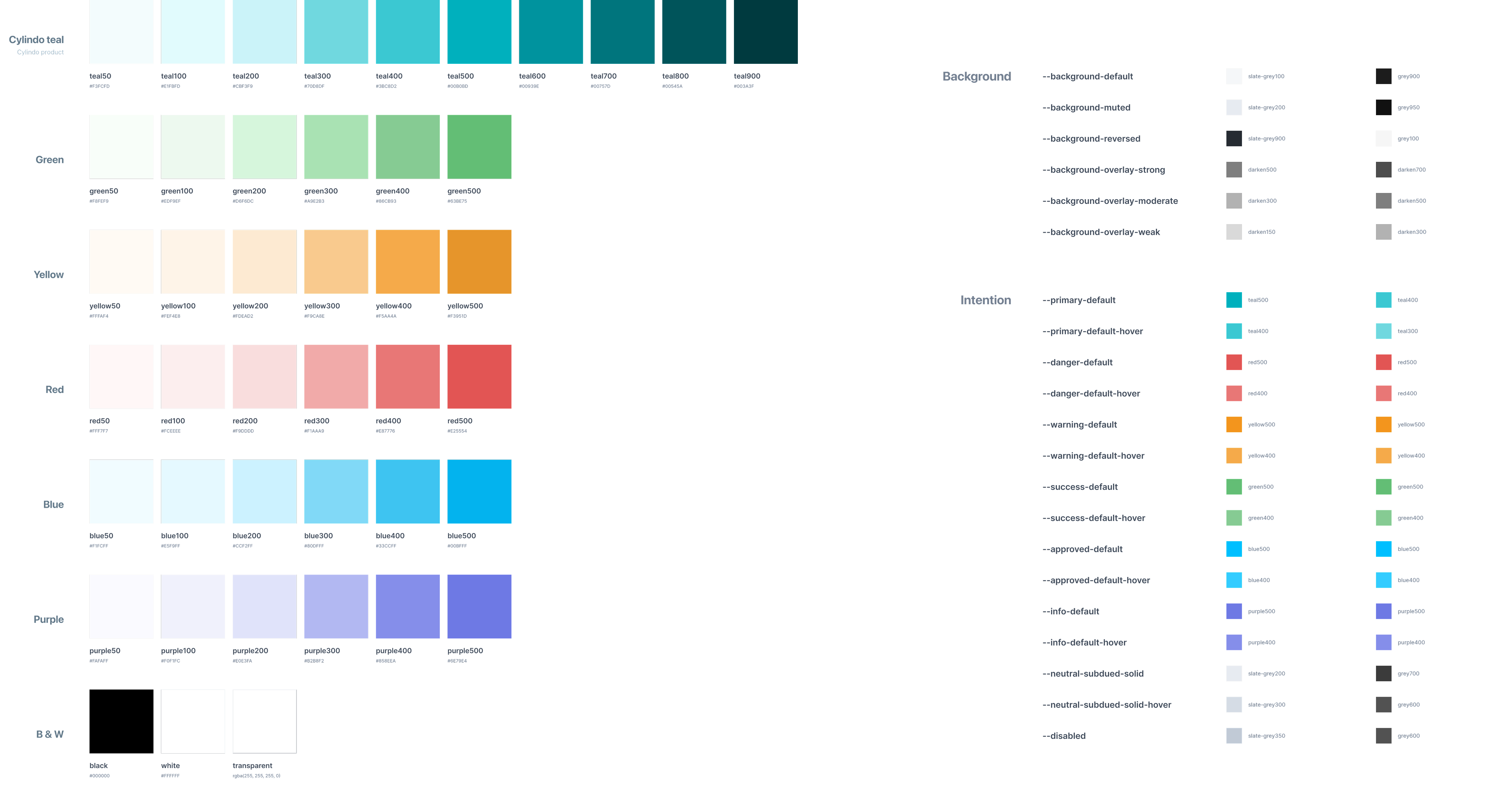
A small snippet of Cylindo UI’s primitive and semantic color tokens.
Bi-weekly syncs, color tokens in Figma, more components, support for responsive designs…
As the work on the Design System gained traction among designers and developers, I worked on several important initiatives.
- Process and communication – Introducing a bi-weekly meeting to plan the work, decide priorities, and discuss the development of individual components. Creation of the #design-system channel in Slack to raise agenda points for the bi-weekly syncs, announce updates, hold async discussions, and more.
- Support for color tokens in Figma – With the release of variables in Figma, the design components could finally be updated to use color tokens. That simplified the handover of components to developers and enabled the preview of all designs in the dark theme!
- More components and more specialized – New components such as the Card, Segmented control, and Toast were added. We also built more complex and tailored components like the Slider input, File uploader, Empty state, and Code snippet.
- Responsive approach – With the increased focus on the end user, more work was put into making all components and new pages fully responsive and incrementally adapting the most relevant pages/flows to work on small screens. Support for pre-defined breakpoints (small, medium, large, x-large) was also added.
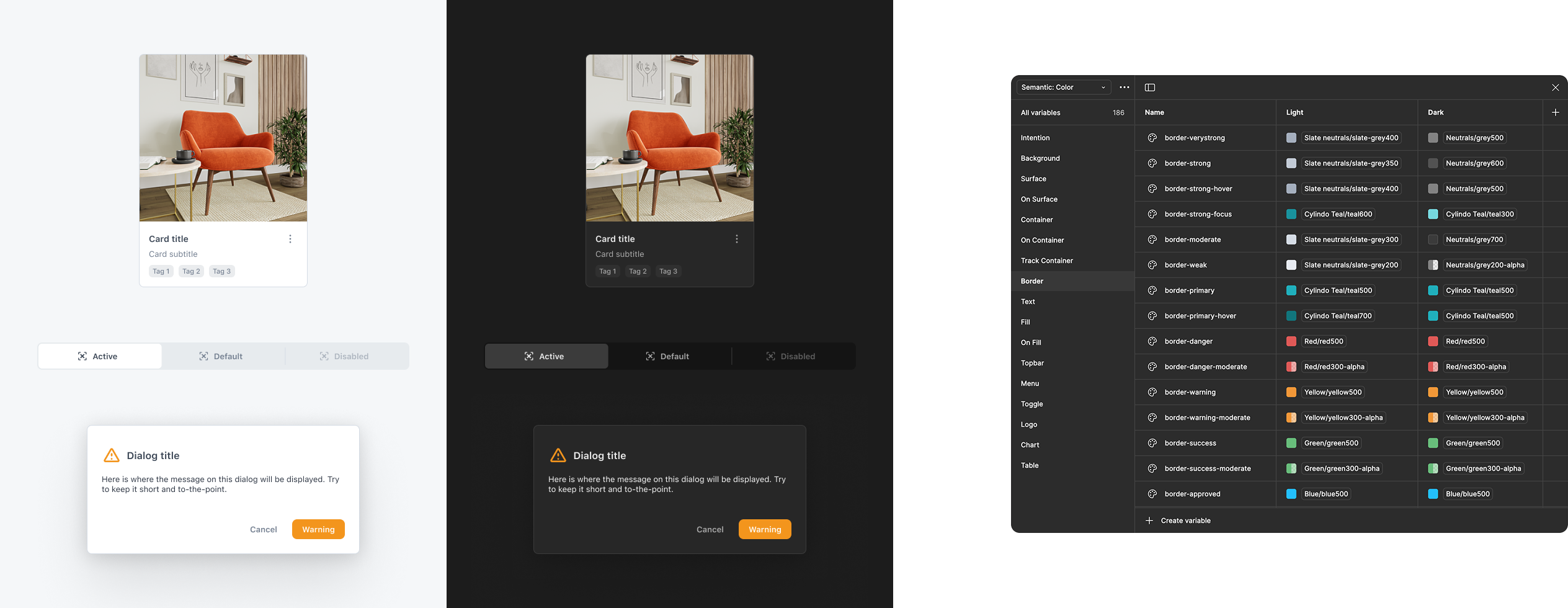
Color tokens (variables) in Figma and light/dark theme preview of 3 components.
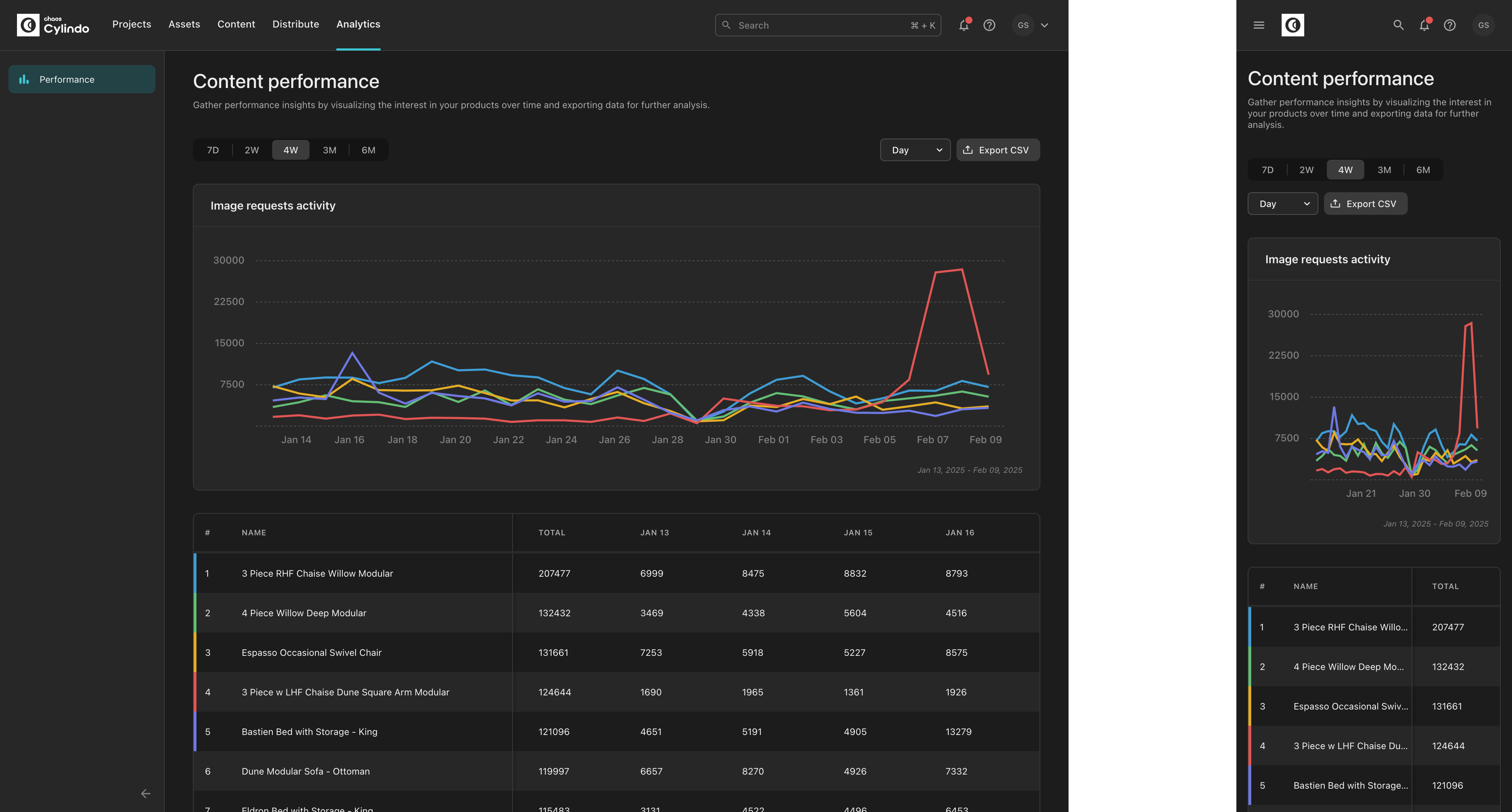
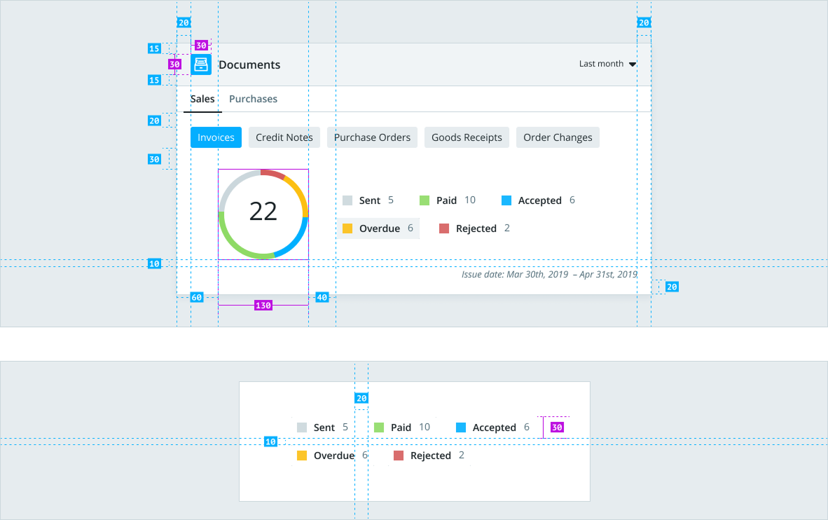
This fully adaptable analytics page was made possible by building responsive components and setting breakpoints.
Moving Cylindo UI to a separate repository
For a long time, the components library was an integral part of Cylindo’s main application repository. As the product grew and new repos were created to maintain separate tools connected to the platform, it became imperative to move the components into a separate library. The library would be imported by those multiple applications.
In late 2023 the cylindo-ui repository was created. As of February 2025, the library contained over 80 components. It had more than 430 releases, and code from 17 contributors (including myself!).

Work materialized
With the Alert box as an example, here we can see the different points of view of a Cylindo UI component.
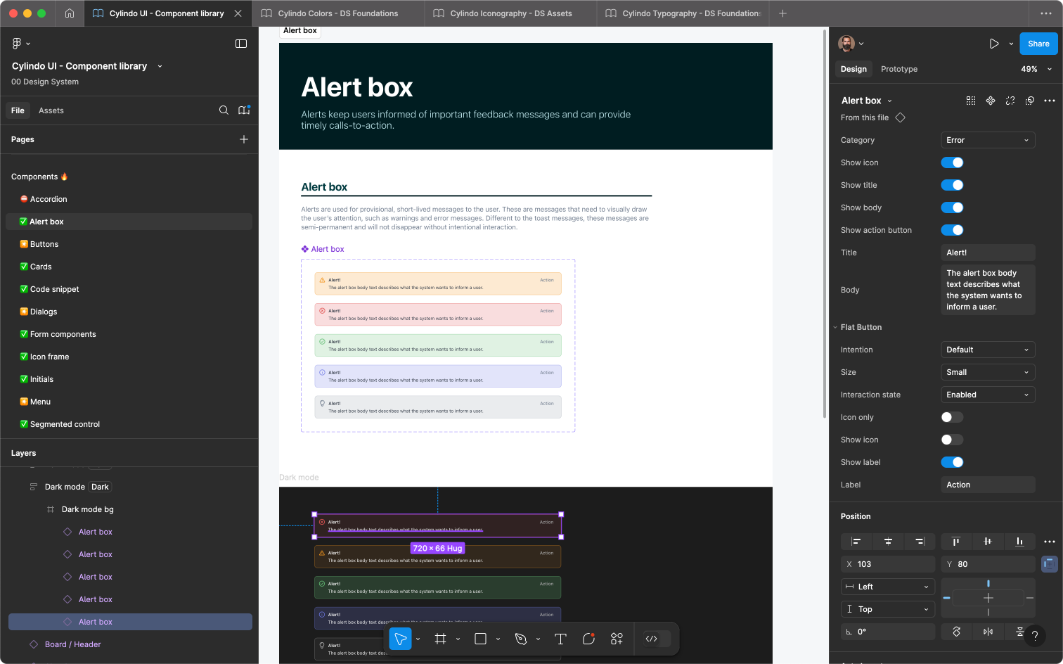
UI components are designed and prototyped using Figma.
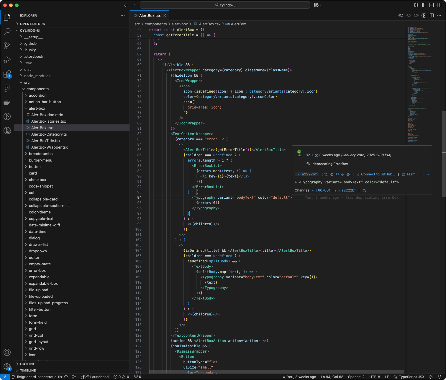
In cylindo-ui, they are built as styled components in Typescript.
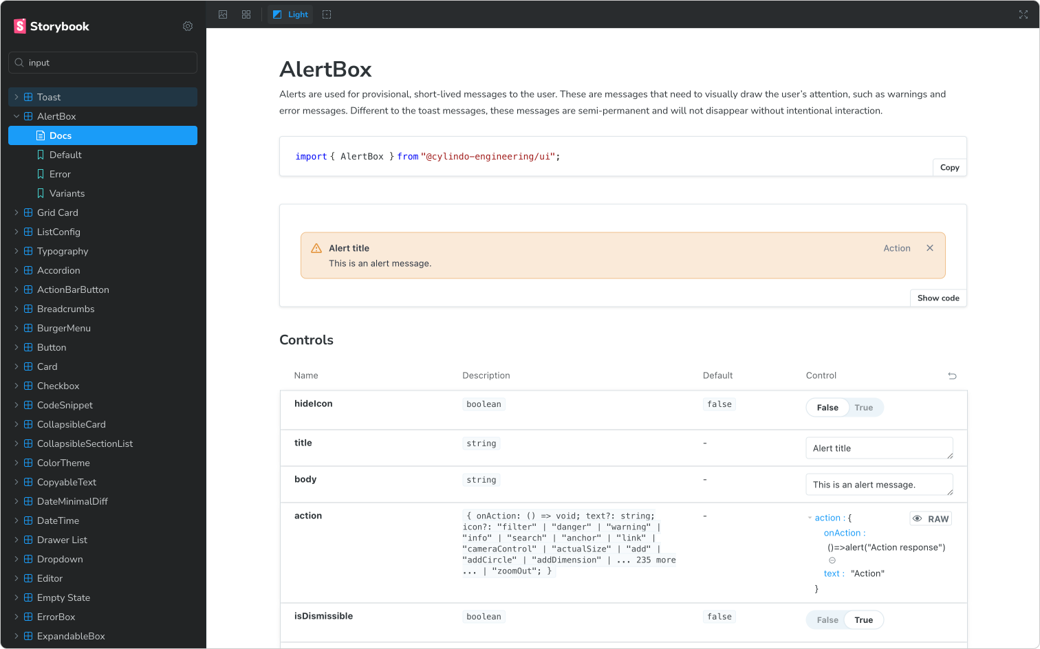
Storybook is the visual representation of cylindo-ui. It’s where both UX designers and developers can browse for existing components.
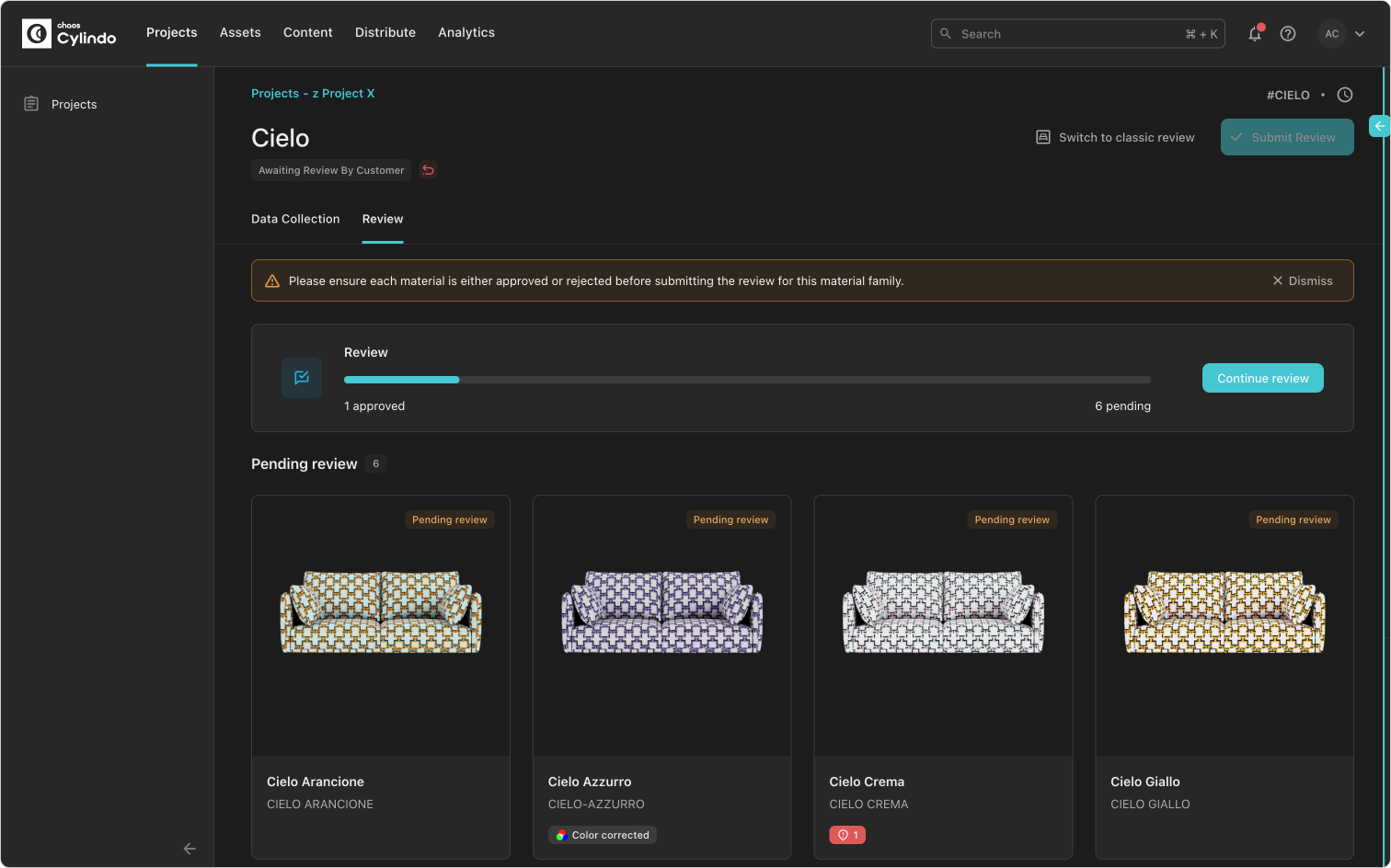
Finally, Chaos Cylindo CMS is the main host application making use of Cylindo UI and where end-users will interact with the components build through the Design System.
Cylindo UI now and the future
The Design System is constantly in progress and at this point has matured greatly, being used by 4 designers and a growing software development team. It is imported by 3 applications, which solidifies it as a key part of the product development in Chaos Cylindo.
Keeping to the theme of constant progress, some of the points for improvement include:
- Documentation – Both the design and technical documentation can be further developed. From a design perspective, the most important updates are on interaction details and the do’s and don’ts. On the technical side, better implementation guides should be added to most components.
- Even more specialized components – Most of the existing components & patterns in Cylindo UI have been designed and developed focused on the Project Management / CMS aspect of the platform. As more specialized content creation and editing tools such as Cylindo Studio are developed, the Design System needs to evolve to support their unique requirements.


