
The project
After years of working heavily on delivering features and improve the experience on various points of the procurement process to its enterprise customers and connecting them to their supply chain, it was set a goal at Tradeshift to focus on the other end of such connections, the sellers.
The seller’s experience in Tradeshift was lacking some starting point, something that is a standard in similar web platforms. Our sellers needed a dashboard where they could easily get started and familiarized with the platform, have easy access to the most relevant information in their accounts, trigger key actions and find themselves around.
My role
As the UX/UI Designer, I was responsible for defining the user segments that this dashboard was going to be introduced to, understanding their user-journeys and each segment’s specific needs, building the journey maps, prioritize feature releases with the PM, testing prototypes with users, building the final layouts and syncing with frontend developers to get the designs developed as defined.
Duration
This project was started in January 2019 and the MVP was released in December 2019.
Background
Tradeshift is a cloud-based business-to-business network and platform for supply chain payments. As a network, buying companies that purchase Tradeshift’s solutions create their company’s and user accounts and invite their sellers to join the platform as well. This is done through onboarding campaigns, where sellers receive email invitations from their buyers to go through the account creation process in Tradeshift, with the goal to exchange documents, product catalogs, and more.
The previous user experience for sellers was disjointed, confusing, and lacking in direction. Sellers created their accounts and found themselves on the platform with little guidance about what they should do, how to achieve the goals they need to achieve, and solve the tasks they joined the platform to solve. The platform contains an enormous and ever-growing number of apps and functionalities, all of which are given the same weight to any given user and increase the confusion and lack of focus.
Understanding the problem
The first thing that needed to be done was to understand who were these sellers using Tradeshift’s platform.
Combining research studies conducted by the UX research team with knowledge spread around the company – with various Product Managers, customer-facing teams, and designers involved in the various products that Tradeshift develops, I’ve put together some basic scenarios for the multiple kinds of operations sellers could perform on the platform.
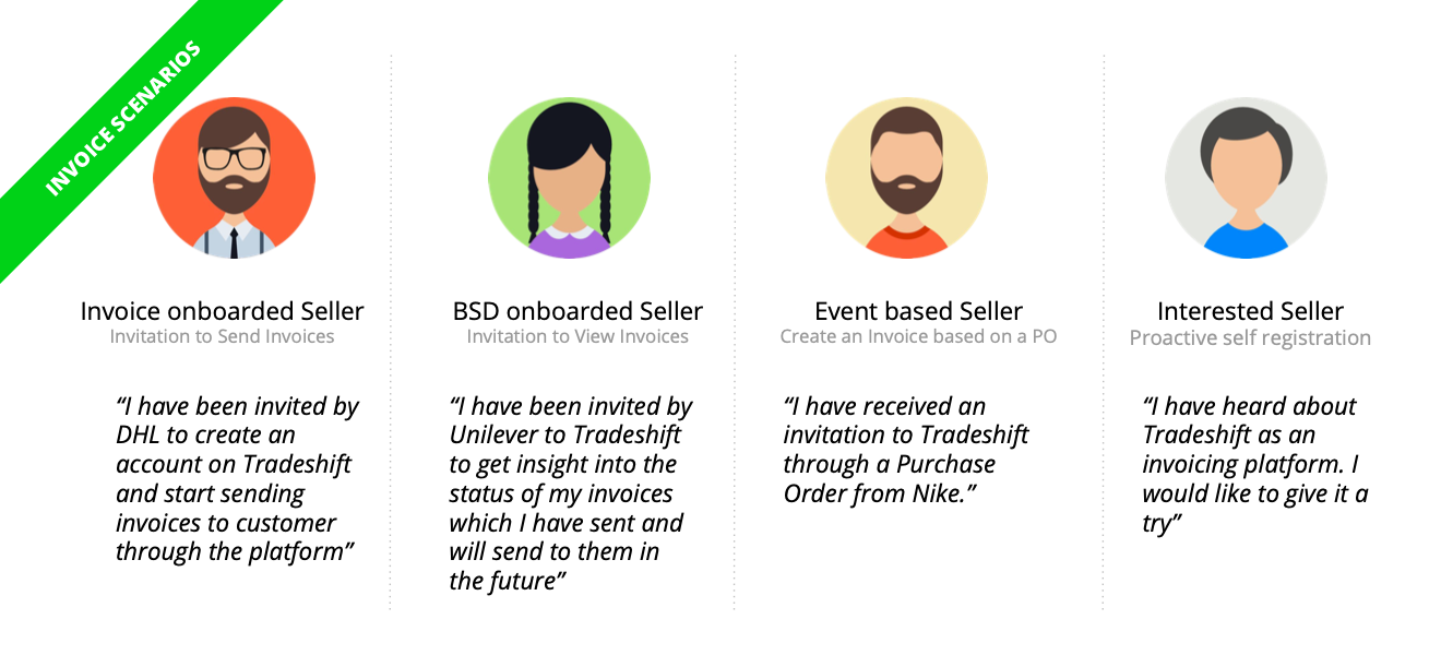
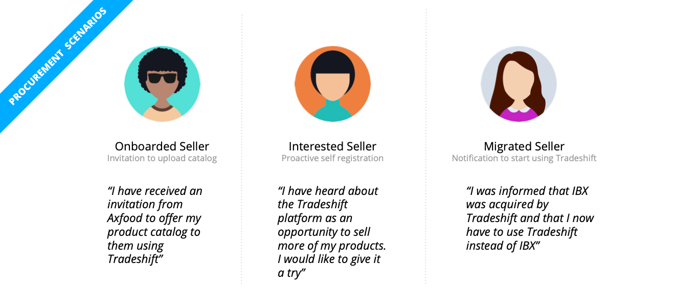

For each of these scenarios, I’ve worked with the relevant stakeholders to identify the users’ journeys, apps used in the platform, onboarding needs, most relevant data, and common actions.
First concept, journeys & steps
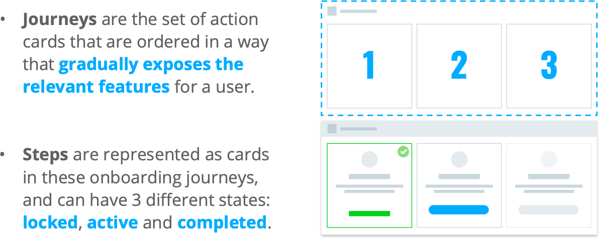
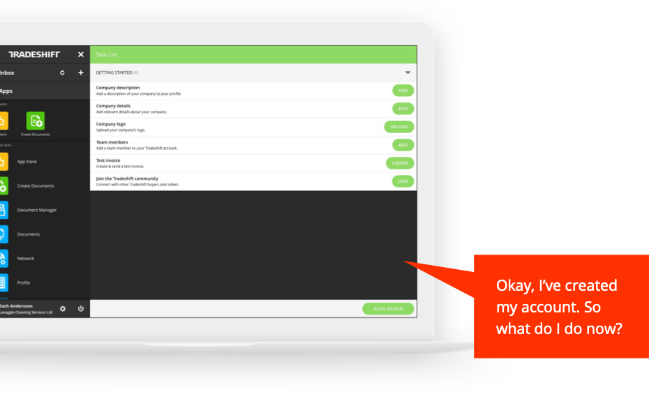
The first idea that was explored was to tie down the sellers’ initial onboarding needs in a guided experience, right after their account creation.
This led to the creation of a document with the main actions these sellers should take to get started with the products they need to use.
For all the scenarios, I also designed a user-journey flow, with which later discussions could be held with the stakeholders.

Simplify the onboarding, focus on operations
Tradeshift’s platform was heavily built after its corporate customers’ specific needs. There is a huge effort by professional services teams to make for the documents traded to be handled correctly within the procurement systems these companies have in place, and campaigns for onboarding their suppliers. This means that though we tried to push for consistent and simple actions for the sellers to connect with their buyers and start sending/receiving documents, there was a technical barrier to this plug-and-play approach we first envisioned. The idea was put aside at that time.
That led to the decision of focusing on the suppliers already using the platform and those being onboarded through campaigns.
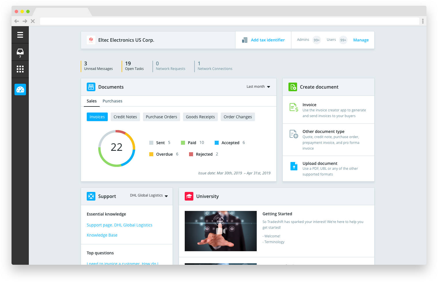
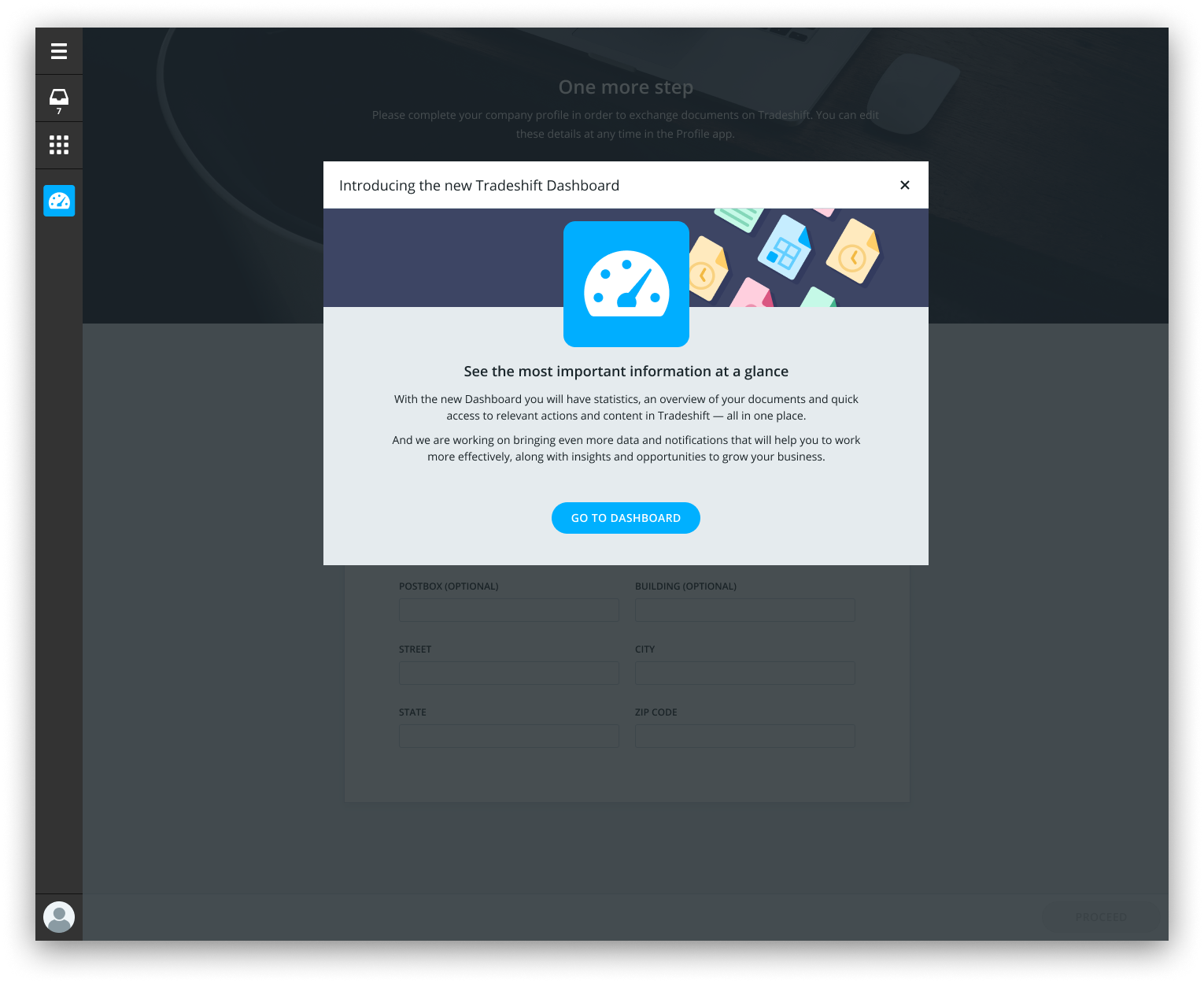
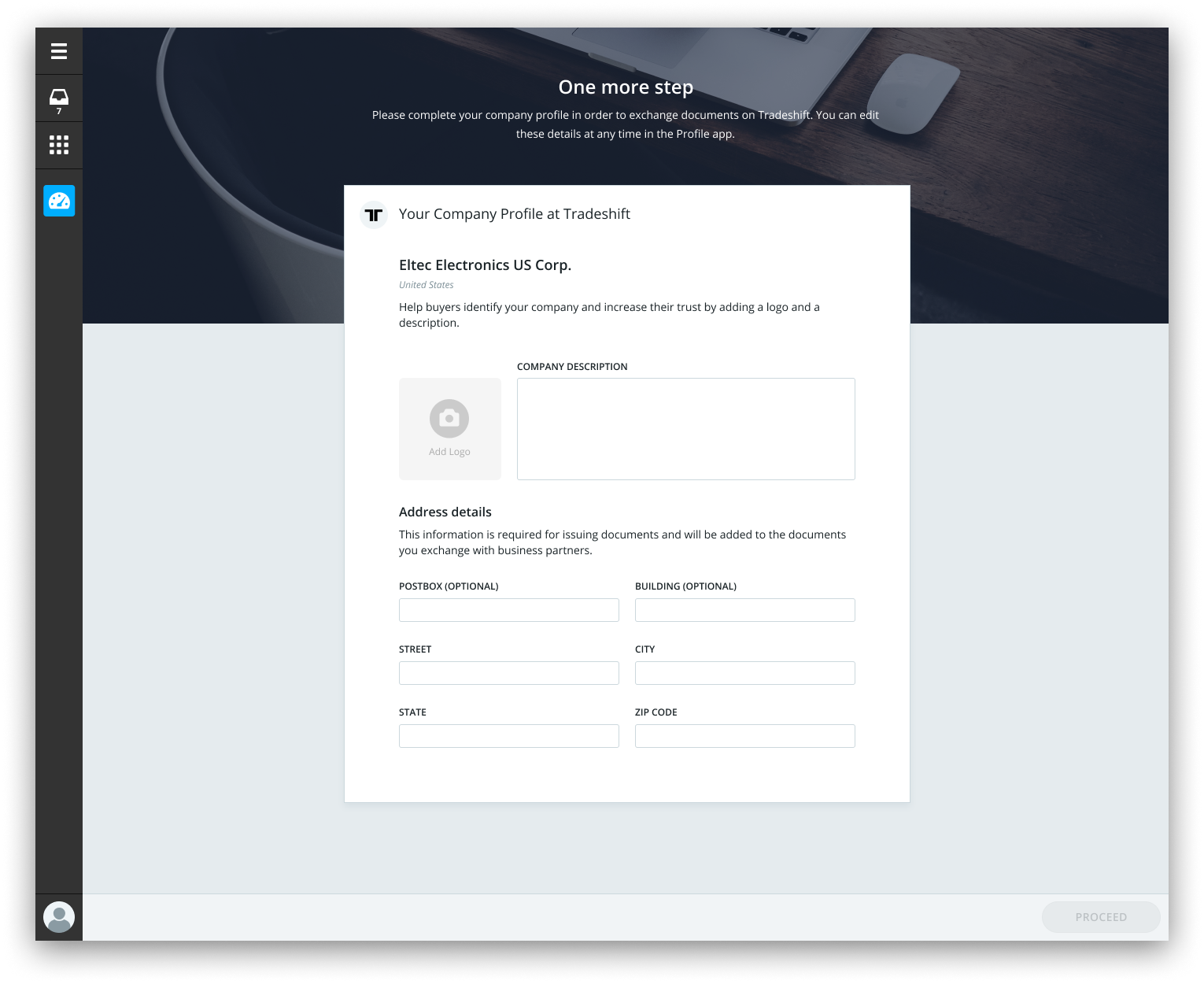
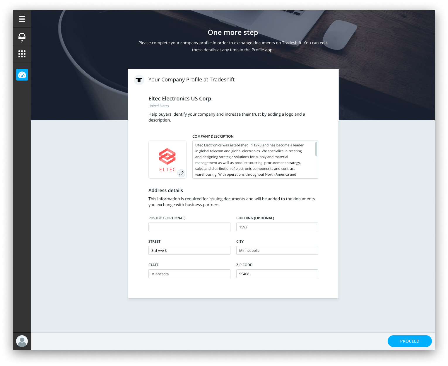
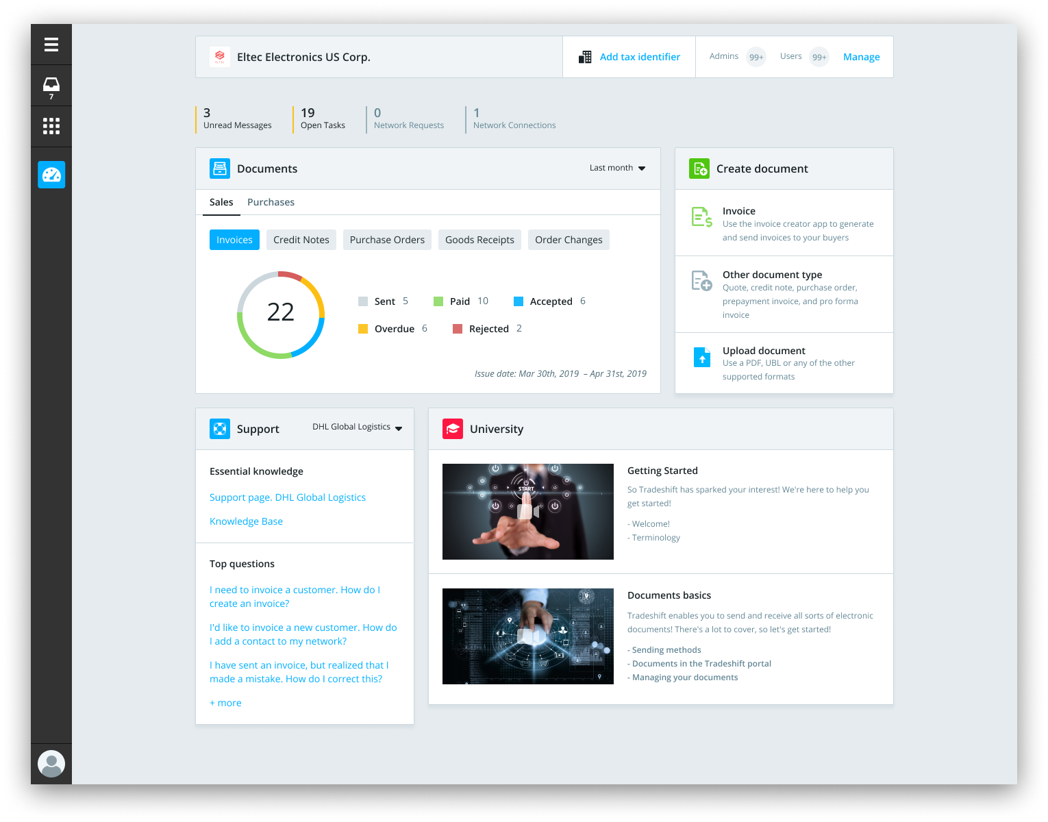
The journeys and steps gave place to a simple dashboard introduction modal, a reminder to add missing information, and a modular operational dashboard.
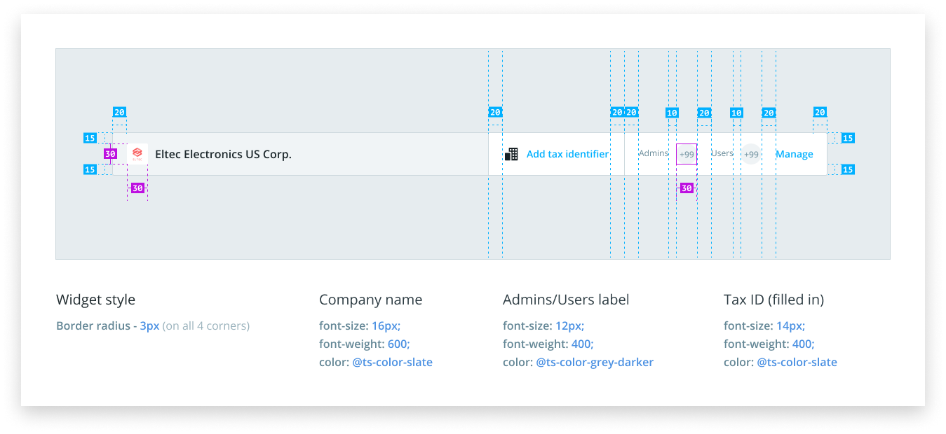
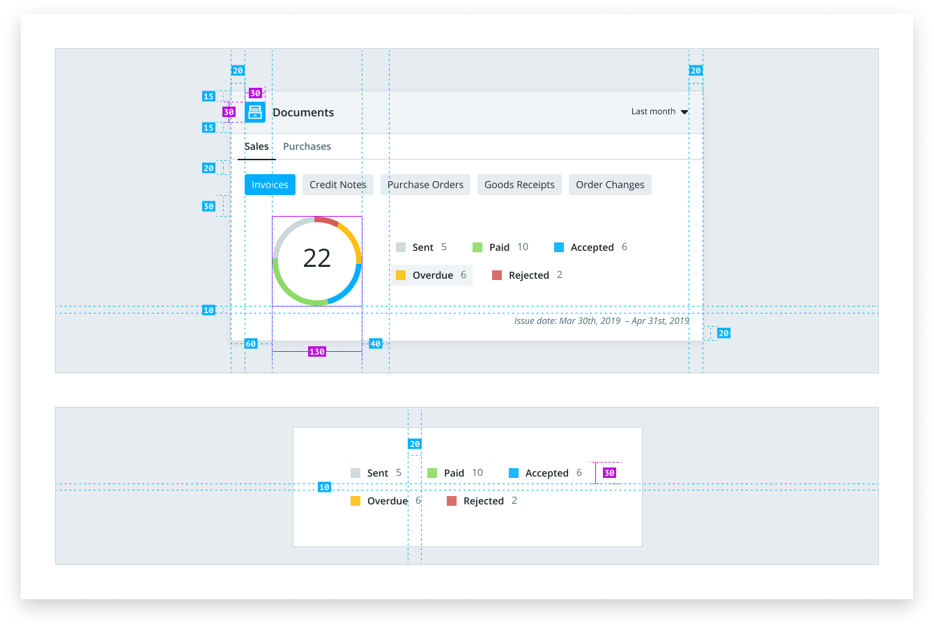
Main widgets UI documentation
Here is part of the UI documentation shared with frontend developers.
Dashboard release
The new dashboard was introduced both to new sellers joining the platform and those already using it.

Upcoming – Dashboard conversion and new widgets
An important aspect of this dashboard release was to introduce the use of metrics to check its adoption rate by existing sellers, validate the hypothesis that a simplified onboarding process would increase the conversion rate of new sellers, and whether or not providing easier access to their documents would increase these documents’ processing time.
The modular nature of the dashboard, together with the newly introduced metrics, also allowed quick testing of new widgets that could speed up other processes that sellers could perform in the platform.
I left Tradeshift right after the release of the Seller’s Dashboard release, though. So I didn’t get the chance to view this data.
If you want to check if Tradeshift can improve you company’s procurement processes and see the Seller’s Dashboard live, you can do so at go.tradeshift.com